

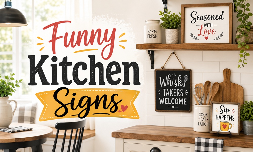
The kitchen is the one room in the house where a sign is genuinely functional. It sits at eye level while you’re standing at a counter, waiting for water to boil, doing something repetitive, and looking for a reason to smile.
That’s why kitchen signs outlast most other humorous decor. And it’s also why the bad ones are so grating — you’re looking at them constantly.
This guide covers the practical side almost nobody writes about: which material to buy, exactly where to hang it, how big it should be, and which category of joke ages well. Plus a sorted library of sayings, and how to make one yourself.
Why Kitchen Signs Work Better Than Other Funny Decor
Three structural reasons.
Repetition without dwell time. You pass a kitchen sign a hundred times a week for three seconds each time. A joke you glance at survives far longer than one you sit and stare at.
Kitchens tolerate personality. Living rooms are performances. Kitchens are honest. Funny kitchen wall art makes cooking a delight precisely because the room is already casual.
The kitchen has usable dead wall space. Above the door. Beside the fridge. Over the range hood. Under the upper cabinets. These are the awkward gaps that no artwork fits, and that a sign fills perfectly.
Part 1 — Materials: What to Actually Buy
Material is what determines whether the sign reads as charming or as clutter. It also determines whether it survives a kitchen.
The Materials Table
| Material | Look | Kitchen durability | Price | Best for |
|---|---|---|---|---|
| Solid wood, painted + vinyl lettering | Rustic, handmade | Good, if sealed | ££ | Farmhouse, cottage |
| Wood-slat / pallet sign | Rustic look built from pine slats | Good | £ | Country, coastal |
| Retro tin / metal | Weathered, distressed, diner-style | Excellent — wipes clean | £ | Retro, industrial, mid-century |
| Framed canvas | Gallery-wrapped on pine frames | Poor near a hob | ££ | Modern, typography-led |
| Framed paper print | Clean, editorial | Poor unglazed | £ | Modern, minimal |
| Vinyl wall decal | Adhesive, no frame | Fair | £ | Renters, curved surfaces |
| Laser-cut metal word art | Laser-cut iron with distressed finish | Excellent | ££ | Contemporary rustic |
| LED marquee sign | Battery-operated, mimics a classic marquee | Good | £££ | Coffee bars, statement walls |
| Ceramic tile / plaque | Heritage | Excellent | ££ | Traditional, European |
| Chalkboard | Changeable | Excellent | £ | People who want to rotate the joke |
The Kitchen-Specific Durability Rules
This is the section that gets skipped, and it’s the reason people replace signs every two years.
Grease travels. Anything within roughly 1.5 metres of a hob accumulates an invisible film. Unsealed wood absorbs it and darkens. Canvas absorbs it and cannot be cleaned.
Steam warps. Above a kettle, above a dishwasher, and directly opposite an open oven are all warp zones. Handmade wooden signs are typically made for indoor use only and have no protective coat on the backside — the unfinished back is exactly where warping starts.
Sun bleaches. A sign opposite a window loses its lettering contrast within a couple of years.
The Zone-by-Material Match
| Kitchen zone | Safe materials | Avoid |
|---|---|---|
| Above the hob / range hood | Metal, ceramic tile | Wood, canvas, paper |
| Beside the fridge | Anything | — |
| Above the sink | Metal, sealed wood | Canvas, unglazed paper |
| Above a doorway | Anything | — |
| Coffee bar / bar cart | LED marquee, metal, framed print | — |
| Pantry door | Wood sign, sized to the door width | — |
| Under upper cabinets | Small framed prints, tile | Anything deep |
| Dining side of an open plan | Canvas, framed print | Metal (too loud a texture) |
The Handmade Wood Sign Reality
Solid wood signs are made to order and carry natural imperfections — holes, knots and blemishes that aren’t hidden. No two signs are exactly alike, which is what gives them their rustic, farmhouse character.
Text is usually created with premium vinyl and intended for indoor use only. Signs made from untreated lumber should not be placed outside in direct sunlight, rain or snow. Outdoor versions need a different finish and re-coating roughly every six months.
Most handmade signs arrive with a sawtooth hanger already installed and are hang-ready. Framed signs thick enough — around 2 inches — can also stand alone on a shelf rather than hang.
Part 2 — Sizing and Placement
Size by Location
| Location | Recommended sign size |
|---|---|
| Above a doorway | Door width minus 4″–6″ |
| Above the range hood | Half to two-thirds hood width |
| Beside the fridge (vertical gap) | Narrow, 6″–10″ wide, 20″+ tall |
| On a countertop, leaning | 7″ × 7″ to 12″ × 12″ |
| Above a sideboard or console | Half to two-thirds the furniture width |
| Pantry door | 10″–14″ wide |
| Gallery grouping | Mixed; treat as one unit |
For reference, a common commercial tin sign runs approximately 12″ long by 8″ wide with pre-drilled mounting holes, and a typical framed wood sign around 7″ × 7″ × 2″.
Height
Kitchens are standing rooms.
In kitchens and hallways you’re likely to be standing, so the right hanging height is generally higher than the standard rule.
| Rule | Height |
|---|---|
| General art centre height | 57–62 inches from the floor |
| Kitchen (standing) | Bias to 60″–65″ |
| Above a countertop | 18″–24″ above the counter surface |
| Above a doorway | 4″–8″ above the frame |
| Sightline test | Should be visible while standing at the sink |
The practical test that beats every rule: stand where you actually stand — at the sink, at the hob, at the coffee machine — and hold the sign at the height where your eyes land when you look up. Mark it. That’s the height.
Grouping
Treat a grouping as one piece and centre it at 57–60 inches. Space frames 2–3 inches apart.
Kitchen groupings work best as one sign plus two non-signs — a sign, a small print, and a shelf or hook. Three signs together read as a gift shop.
Part 3 — The Sayings Library, Sorted by Longevity
Not all kitchen humour ages the same way. Here it is, ranked.
Tier 1 — The Ones That Last (Structural Jokes)
Humour built on a stable, universal observation. Nobody outgrows these.
- Signs about dishes never being done. The joke is renewable because the dishes are renewable. “Don’t worry dishes, no one is doing me either” is one of the most-sold sign texts in the category.
- Signs about “homemade” being a flexible term. The “I stirred it” genre plays on the elastic definition of homemade — if it was opened inside your home, is it homemade?
- Signs about hunger as a personality state. The hangry and accidental-snacking category “hits close to home” for most households.
- Signs acknowledging that the kitchen rules will be ignored. A rustic wooden sign is a funny way of keeping your kitchen rules followed.
Tier 2 — Format Jokes (Long-Lasting, Because the Format Does the Work)
The humour lives in the presentation, not the sentence.
- The dictionary definition sign. Serious font, white background, set up to look like a dictionary entry — then the definition is funny. It pulls visitors in for a closer look because they think they’re about to read something philosophical. This is the single strongest format in the category.
- The mock official notice. Health-and-safety parody, department signage, regulatory language applied to snacks.
- The fake menu board. “Today’s menu: take it or leave it” on a weathered background with a 1950s illustration — the retro framing carries it.
- The fake vintage advertisement. “Fresh Coffee. Have a Cup!” in vintage marquee styling.
Tier 3 — Wordplay and Puns (Charming, Decays Slowly)
- Food puns. “Lettuce turnip the beet” is the archetype — groan-worthy on purpose, which is why it survives.
- Coffee puns. The most durable pun subcategory, because caffeine is a daily ritual.
- Music and lyric references. Rap-reference signs are a recognised sub-genre.
Tier 4 — Shock and Crude Humour (Decays Fast)
Signs with strong-language humour “might not work in every home.” Some signs are inadvisable for homes with young children. Crude signs — the “butt nugget” tier — are funny for exactly as long as it takes for your mother-in-law to visit.
Assessment: buy them as gifts. Don’t buy them for your own kitchen unless you never have guests.
Tier 5 — The Sentimental Trap
This is the boundary of the category, and where funny signs mutate into something else.
“Best Is Yet To Come,” “This Is Us, Our Life, Our Story, Our Home,” “Blessed,” “Family” — these are not funny signs. They’re sincerity signs wearing the same clothes.
There’s nothing wrong with them, but be aware of what you’re buying. This is the aesthetic lineage that produced “Live Laugh Love,” and it is the aesthetic that most design-forward buyers are actively avoiding.
If you want humour, avoid script fonts entirely. Script is the tell.
Part 4 — Making the Sign Yourself
Kitchen signs are the single easiest DIY decor object in a home, because the material is small and the joke is yours.
Method 1 — The Vinyl-on-Wood Sign (Most Common)
- Board. Solid pine or oak, 3/4″–2″ thick, cut to size.
- Sand. 120 grit, then 220.
- Base coat. Two coats of matte paint. White background with black text, or black background with white text, are the two standard schemes.
- Stain the edges. A medium or dark espresso stain on the borders gives the farmhouse frame effect.
- Lettering. Cut vinyl on a craft cutter; transfer with application tape. Burnish thoroughly.
- Seal. Water-based polyurethane, matte. Two coats. Seal the back too — this is the step that prevents warping in a kitchen.
- Hardware. Sawtooth hanger, installed centred.
Method 2 — The Framed Print (Cheapest, Fastest)
Wall art prints come unframed in a variety of punny sayings, so you can choose which style of frame best suits your home.
Print at 250gsm on matte paper, put it behind glass, hang it. Ten minutes. Change the joke whenever you like.
Method 3 — The Chalkboard
The only sign that stays permanently funny, because you rewrite it. Ideal near a school-run family calendar or a coffee station.
Method 4 — The Vinyl Decal
Adhesive vinyl wall decals bring humour into a kitchen quickly and infuse the space with personality and wit — without a frame.
Best for renters, backsplashes, cabinet doors and fridge sides. Remove with a hairdryer and slow, low-angle peeling.
DIY Cost Comparison
| Method | Material cost | Time | Skill |
|---|---|---|---|
| Framed print | £/$ 10–20 | 10 min | None |
| Vinyl decal | £/$ 5–15 | 20 min | Low |
| Chalkboard | £/$ 15–30 | 30 min | Low |
| Vinyl-on-wood | £/$ 20–40 | 3 hrs + drying | Medium |
| Router-carved wood | £/$ 30–60 | 5 hrs | High |
Part 5 — Styling: Making a Sign Look Designed, Not Bought
Six rules.
1. One sign per kitchen. Possibly two in an open-plan kitchen-diner. Never three in a row.
2. Match the sign’s era to the kitchen’s era. Distressed metal signs with 1950s illustration suit a retro or diner kitchen; a wood-framed rustic sign suits farmhouse decor. A tin diner sign in a handleless modern kitchen looks like an accident.
3. Pair the sign with function, not with more decor. A sign above a hook rail. A sign above a spice shelf. A sign beside the coffee machine. Signs floating alone on a large wall look stranded.
4. Kill the script font. Serif or sans, condensed or wide, but not looping script — script is the single strongest visual marker of the sincerity-decor genre.
5. Let the frame be better than the joke. A wood frame gives a rustic feel; a slim gold frame around an absurd line is funnier than the same line on a plaque.
6. Consider negative space. A small sign in the centre of a bare wall reads as deliberate. A small sign wedged between a spice rack and a calendar reads as clutter.
What Do Real Buyers Say?
Themes drawn from marketplace review patterns, Reddit (r/HomeDecorating, r/InteriorDesign, r/Cooking), Quora threads on kitchen decor, and Medium essays on farmhouse-style fatigue:
- “Bigger than expected” is the most common positive review. It recurs constantly across kitchen sign listings, which means most buyers underestimate size — and are happy to be wrong.
- Weight and hanging hardware are the top practical complaints. Buyers specifically praise signs that are “light enough that it was easy to hang, heavy enough that it wouldn’t bend.”
- Metal signs win on cleanability. Owners of wood signs near a hob consistently report darkening and grease absorption. Owners of metal signs do not.
- The joke that survives is the one about dishes. Across every marketplace, every era, every material.
- Farmhouse fatigue is real and widely discussed. Design-oriented threads increasingly treat “distressed white wood + script font” as dated. The same joke on a plain framed print reads as contemporary.
- Gift purchasing dominates the category. Reviewers repeatedly note buying signs as housewarming or friend gifts rather than for themselves — worth remembering when judging what’s popular.
- Custom signs get the best reviews. Personalised or made-to-order pieces consistently outperform mass-market ones in satisfaction, at a modest price premium.
Frequently Asked Questions
Where should I hang a funny kitchen sign? Wherever your eyes land when you look up from a task: above the sink, beside the fridge, above a doorway, or over the coffee station. Kitchens are standing rooms, so hang slightly higher than the standard 57–62 inch centre rule — in kitchens and hallways the right height is generally higher.
What size should a kitchen sign be? Common sizes run from 7″ × 7″ freestanding to 12″ × 8″ wall-mounted tin signs. Above furniture or a hood, target half to two-thirds of the width beneath it.
What material is best for a kitchen sign? Metal near heat and steam; sealed wood everywhere else. Metal signs mounted with pre-drilled holes suit kitchens, cafes and restaurants and wipe clean. Canvas and unglazed paper degrade near a hob.
Can I hang a wooden sign above the stove? Not recommended. Grease and steam are absorbed by wood and vinyl lettering, and most handmade signs have an unfinished back with no protective coat — the point where warping begins. Use metal or ceramic there.
Are funny kitchen signs tacky? The material and the font decide, not the joke. A dictionary-format print in a slim frame reads as wit. Distressed white wood with script lettering reads as a decade-old trend. Humorous, occasionally cheeky kitchen wall art might not suit all tastes — which is fine, because it’s your kitchen.
What’s the best funny kitchen sign saying? The most durable jokes are structural rather than topical: dishes, snacking, the meaning of “homemade,” and rules nobody follows. The dictionary-definition format is one of the most effective, because the serious presentation makes the punchline land harder.
How do I make a funny kitchen sign myself? Paint a board, apply vinyl lettering, seal both sides, attach a sawtooth hanger. Or, for ten minutes’ work, print your own line at 250gsm and put it in a frame. Unframed prints are widely sold precisely so you can choose your own frame.
Should the sign match my kitchen style? Yes. Retro tin in a retro kitchen; framed typography in a modern kitchen; painted wood in a farmhouse kitchen. Mismatching material and era is what makes a sign read as an afterthought.