

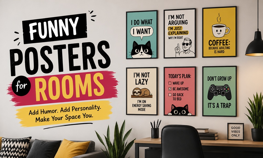
A great funny poster costs eighteen dollars and looks like it cost a hundred and eighty. A bad one costs eighteen dollars and looks like it cost four.
The difference has almost nothing to do with the joke and almost everything to do with paper weight, size and how it’s mounted. This is a buyer’s guide, not an inspiration board. It covers the specs that determine whether a poster looks intentional on your wall or looks like it was blu-tacked there during freshers’ week.
Quick Answer
Funny posters bring personality and laughter into a space, and work in dorms, breakrooms, home offices and living rooms. To make one look good: buy at least 200gsm paper, go one size larger than you think, frame it with a mount, and hang the centre at 57 inches.
Everything below expands on that.
Poster Sizes: What to Actually Buy
Poster sizing is the single most common mistake. Almost everyone buys too small.
The Two Sizing Systems
Most of the world uses the A-series (ISO 216). The US and Canada use imperial inches. Frames and prints from different systems do not match, and this catches people out constantly.
A-Series (Europe, Asia, Australia)
| Size | mm | inches | Use case |
|---|---|---|---|
| A5 | 148 × 210 | 5.8 × 8.3 | Tiny; desk only |
| A4 | 210 × 297 | 8.3 × 11.7 | Gallery wall filler |
| A3 | 297 × 420 | 11.7 × 16.5 | Standard small poster |
| A2 | 420 × 594 | 16.5 × 23.4 | The sweet spot |
| A1 | 594 × 841 | 23.4 × 33.1 | Statement piece |
| A0 | 841 × 1189 | 33.1 × 46.8 | Feature wall |
Imperial (US / Canada)
| Size (inches) | Use case |
|---|---|
| 5 × 7 | Personal photos |
| 8 × 10 | Gallery wall filler |
| 11 × 14 | Small poster |
| 16 × 20 | The sweet spot |
| 18 × 24 | Standard poster size |
| 24 × 36 | Large poster / feature |
| 27 × 40 | Cinema one-sheet |
Standard frame sizes range from small (4×6, 5×7) for photos to larger (18×24, 24×36) for posters and art prints.
The Sizing Rules
Above furniture: art should take up at least one-half to two-thirds the width of the furniture below it.
| Furniture width | Poster width target |
|---|---|
| 3-seat sofa (~84″) | 42″–56″ (or a grouping) |
| Double bed (~54″) | 27″–36″ |
| Desk (~48″) | 24″–32″ |
| Console (~40″) | 20″–27″ |
On an empty wall: Fill as much of the wall space as possible. Bigger is better — when in doubt, try an oversized piece. It will look much better than a dinky piece on a large wall.
The universal correction: whatever size you’re about to buy, go up one.
Standard vs Custom
Standard sizing works for prints that match common dimensions (A4, A3, A2, 8×10, 16×20) — widely available, affordable and easy to replace. Best for gallery walls, rentals, and anyone who rotates their art regularly. Custom sizing is only necessary for non-standard dimensions, panoramic images or heirloom pieces you want to preserve long-term.
For funny posters, always buy standard. You will want to swap it.
Paper, Finish and Print Quality
This is the section that separates a poster that looks like art from one that looks like a flyer.
Paper Weight (GSM)
| Weight | Feel | Verdict for posters |
|---|---|---|
| Under 130gsm | Flimsy, translucent | Avoid. This is flyer stock. |
| 150–170gsm | Thin poster paper | Budget only |
| 200–250gsm | Substantial, holds flat | Minimum for framing |
| 250–300gsm | Card-like, premium | Ideal |
| 300gsm+ | Fine art / museum board | Best; expensive |
The test: if you can see your hand through the back of the print, it will look cheap on the wall no matter what’s on the front.
Finish
| Finish | Looks | Best for |
|---|---|---|
| Matte | Flat, no glare, ink sits in the paper | Typography, illustration, most funny posters |
| Satin / lustre | Slight sheen | Photography |
| Gloss | Reflective, punchy colour | Cinema-style posters; bad under a window |
| Textured / fine art (e.g. cotton rag) | Visible tooth | High-low subversion, expensive-looking humour |
Rule: matte paper makes a cheap joke look expensive. Gloss paper makes an expensive joke look cheap.
Print Method
| Method | Colour | Longevity |
|---|---|---|
| Giclée / pigment inkjet | Excellent | 50+ years, fade-resistant |
| Dye inkjet | Good | Fades in direct light |
| Offset litho | Very good | Long, but only viable in volume |
| Screen print | Bold, limited palette | Excellent; a collector’s format |
| Home printer | Variable | Will look like a home printer |
Quality printing uses high-quality inks and archival-grade substrates; wide-format printing with proper colour management is what produces exceptional prints.
The Canvas Question
Gallery-wrapped canvas prints on kiln-dried pine frames with pre-installed D-rings arrive ready to hang with no installation required.
| Paper + frame | Canvas | |
|---|---|---|
| Cost | Lower print, higher frame | Higher print, no frame |
| Looks | Sharp, graphic, editorial | Soft, painterly, textural |
| Best for | Typography, illustration, photography | Painted or illustrated humour |
| Swappability | High | Low |
| Verdict for funny posters | Preferred | Use for one large statement |
For text-based humour, canvas is the wrong substrate. Type looks soft and slightly wrong on woven texture.
Framing: The Highest-Leverage Decision
Here is the counter-intuitive principle that runs through this whole category:
The funnier the poster, the more serious the frame should be.
The comedy comes from the gap between the presentation and the content. A stupid joke in a museum-grade frame is much funnier than the same joke in a plastic clip frame.
The Mount (Mat) Rule
Your mount should be 2 to 4 inches larger than the print on each side — a 16×20 print typically looks best in an 18×24 opening.
A mount does three things at once:
- Makes the print look larger and more valuable
- Physically separates the paper from the glass (prevents sticking)
- Signals that the object is art, not a poster
Frame Selection
| Frame | Effect on a funny print |
|---|---|
| Thin black metal | Modern, graphic, clean |
| Wide natural oak | Warm, “gallery,” expensive-looking |
| Thin gold / brass | Elevates absurdity to comedy |
| Ornate vintage gilt | Peak high-low humour |
| Poster clip / frameless | Reads as temporary |
| Plastic snap frame | Reads as an office corridor |
Consistency beats matching. In a room with several posters, identical frames make disparate jokes read as one collection.
Glazing
- Standard glass — cheapest, heaviest, breakable.
- Acrylic / plexiglass — lighter, safer, slightly less clear. Best for large sizes and rentals.
- Non-glare / museum glass — expensive, and worth it only where light is a problem.
Light Damage
Sunlight is rarely the best option for highlighting artwork, since consistent direct exposure to UV rays can lead to damage.
Do not hang a print you love opposite a south-facing window. Fading is not gradual in a way you notice; it’s gradual in a way you notice three years later, all at once.
Hanging: The Numbers
The 57-Inch Rule
Hang your art so that the vertical centre — the mid-point between the top and bottom of the frame — sits at about 57 inches above the floor. That applies to single pieces including posters, and to multi-frame arrangements.
To centre at 57 inches: measure the height of the piece, divide by two, add that to 57, and mark where the top of the frame should be.
The broader working range is 57 to 62 inches from the floor to the centre of the artwork.
Room Adjustments
| Room | Centre height | Reason |
|---|---|---|
| Hallway | 57–60″ | People are standing and moving |
| Living room | 55–57″ | Seated eye level |
| Dining room | 54–57″ | Read from a seated position |
| Bedroom | 55–57″ | Often viewed from bed |
| Above a desk | 4–8″ above the desktop | Ignore the 57″ rule entirely |
Above Furniture
Go about 4 to 8 inches above the top of the furniture. Above a sofa or bed, the bottom of the frame should be about 6 to 12 inches above it.
Gallery Walls of Posters
Think of a grouping as one big piece. Whether it’s a curated arrangement or an eclectic one, the same rule applies: 57 inches to the vertical centre of the whole arrangement.
Space frames about 2 to 3 inches apart. Spread them further and the grouping looks disjointed.
For a museum-like effect, keep gaps between frame edges to 1.5–2.5 inches.
The layout method: lay the frames out on the floor first, adjust until balanced, then use painter’s tape or paper templates on the wall before you commit to nails.
Hanging Without Damaging Walls
Critical for renters, dorms and anyone who moves.
| Method | Max weight | Wall damage | Notes |
|---|---|---|---|
| Adhesive strips (Command-type) | ~7kg / 16lb, in pairs | None if removed correctly | Pull the tab straight down, slowly |
| Adhesive hooks | ~2kg / 5lb | None | Good for small frames |
| Poster putty / museum putty | Paper only | Can lift paint | Fine on posters, risky on old walls |
| Angled nail or screw-in hook | Moderate | Small hole | For drywall or plaster |
| Anchor bolts with plastic wings | Over 10lb on drywall | Larger hole | Wings expand behind the wall |
| Plastic anchor screws (no wings) | Over 10lb on plaster | Larger hole | Better grip in plaster |
| Picture rail + wire | High | None | The elegant solution in older homes |
| Leaning on a shelf | Any | None | Underrated; allows rotation |
Two renter-specific tips:
- Adhesive strips fail in bathrooms and kitchens. Humidity and grease both defeat them.
- Frames leaning on a picture ledge can be swapped in thirty seconds, which is exactly what funny posters want.
Poster Themes by Room
Themes range from silly to sarcastic, from classic cartoon gags and pop culture parodies to visual puns.
Living Room
- Vintage advertising for products that never existed
- Fake museum plaques
- Absurd animal portraits, formally framed
- Mock film posters for mundane domestic events
Bold colour and graphic energy pair with modern furniture and minimal backgrounds. A large print becomes an instant conversation piece and room anchor.
Bedroom
- Quiet, warm, personal humour
- Illustrated rather than typographic
- Retro and mid-century typography prints work well here
Home Office
- Mock-official signage — the “Department of Crazy Ideas” genre
- Deadpan productivity satire
- Anything that survives being in the background of a video call
Hallway / Stairwell
- The densest funny content in the house
- Vintage music and retro typography prints
- A grid of small one-liners; the volume is the joke
Kitchen and Dining
- Cafe posters, coffee prints and food puns
- Bar cart adjacent: drink quotes and cocktail prints
Dorm Room / First Apartment
Prints that add wit to a dorm, breakroom or shared space — the natural home of the confessional and typographic genres, which age badly but are perfectly correct for the moment.
Budget move: A2 unframed prints, hung with a wooden magnetic poster hanger. Cheap, damage-free, replaceable, and infinitely less depressing than tape.
Maximalist / Eclectic Rooms
Bold, offbeat and visually unexpected pieces suit media rooms, teen bedrooms, creative studios and eclectic living spaces. Palettes run loud — neon pink, electric blue, acid green, bright orange alongside graphic black-and-white contrasts.
Budget Tiers
| Tier | Frame | Total look | |
|---|---|---|---|
| Student | A2 unframed, 200gsm | Wooden magnetic hanger | Clean, intentional, temporary |
| Renter | A2 or 16×20, 250gsm | Off-the-shelf frame with mount | Looks like a real decision |
| Considered | A1 or 18×24, giclée on 300gsm | Wide oak frame, acrylic glazing | Reads as art |
| Collector | Screen print, limited edition, signed | Custom frame, museum glazing | Nobody realises it’s a joke until they read it |
The single highest-return upgrade at any tier: add a mount. It costs almost nothing and it transforms perceived value.
Care and Longevity
- Keep it out of direct sun. Consistent UV exposure damages artwork.
- Don’t hang paper prints in a bathroom unless the frame is sealed.
- Store spares flat, not rolled. Rolled posters never fully flatten.
- Rotate seasonally. Rotating funny art with the seasons keeps the humour fresh and timely.
- Dust the frame, not the glass. Spray cleaner onto the cloth, never onto the frame — liquid wicks under the glass and damages the print edge.
What Do Buyers Actually Report?
Themes from Reddit (r/InteriorDesign, r/malelivingspace, r/femalelivingspace, r/frugal), Etsy and marketplace review patterns, Quora decorating threads, and Medium essays on personal decorating:
- Paper weight is the number one review complaint. Reviews consistently praise sellers whose prints “exceed expectations” on quality, and the differentiator is almost always substrate, not design.
- “Bigger than expected. Great quality.” The most common positive review sentiment across print marketplaces — which tells you people habitually order too small and are pleased when they’re wrong.
- Colour shifts between screen and print. Sellers routinely warn that colours may differ slightly due to monitor variation. Order one before ordering four.
- Cheap frames are the visible failure. Owners repeatedly report a print looking “like a poster” until they reframed it, at which point it looked “like art.”
- The magnetic hanger is the community darling. In renter and dorm threads it consistently outranks tape, putty and pins.
- Nobody regrets rotating. The most-repeated satisfaction driver is treating funny posters as changeable rather than permanent.